
Open Preaching
Coincidentally, the week we covered this part of the seerah, the Big Life Journal email that week (I recommend signing up to the free emails if you haven't already!) happened to be linked with a similar lesson to do with overcoming challenges: "Trees stand strong despite high winds because their roots are deep. Similarly, we can stand strong despite the challenges in our lives because we have deep roots which support us: loving people, thoughts, beliefs, values, and so on."
So as part of our reflection on this part of the Prophet (SAW)'s life, we completed the week's Big Life Journal activity together and stuck the finished poster in their bedroom, while reminding ourselves of the Muslims at the time going through their challenges (i.e. ridicule, torture, the boycott, etc.) but never giving up their faith.

We coloured a quarter of the poster each, since it printed on to 4 A4 sheets it was simplest to divide up the work this way (myself, the twins and Z) - and this also represented teamwork and the fact we all share the same roots with each other. I took this opportunity to teach the girls about blending and hues by having us all use colouring pencils. I demonstrated applying different pressure using the same pencil and the effect it had on the colour, as well as colouring lightly with two colours on top of each other so the change between two colours isn't so apparent.
Year of Sadness
We talked about why this time of the Prophet (SAW)'s life is known is the Year of Sadness/Sorrow, how he must have been feeling and why he was able to continue his mission despite that.
Continuing the theme of being strong like a tree, we compared this sadness to a huge challenge and Allah's love and Muhammad (SAW)'s strong faith as being his roots.
I Googled some random photos of landscapes to show the children, first "summer day landscape" then "icy landscape" and asked them how the pictures made them feel - what mood did they give and did they make you feel warm or cold? Then we Googled "flower field landscape" and talked about why these photos made us feel warm and happy - what did they have in common? Bright colours... What kinds of colours? Reds, oranges, yellows and they also said bright blues and greens. I Googled "cold colours landscapes" to show the girls and we talked about why these photos made us feel cold... They were mostly blue, purple and grey colours and they were dull not bright. Finally I googled "warm vs cold colours" to show them a diagram to illustrate that, yes, they were right and the red-orange-yellow side of the colour wheel is associated with warmth whereas the green-blue-purple side is cold.
Bringing them back to the main topic, I asked them if we were to paint something to represent this time of the Prophet (SAW)'s life, which kinds of colours would give the right mood? They answered the cold colours.
As we were talking, I was still scrolling through the example pictures on Google and we came across this one:

I really liked how it showed the contrast between the warm/cold colours in one picture. That's when I had the idea to create a similar painting rather than just doing one to convey a sad mood, and to link it to the growth mindset idea of being strong like a tree.
On a piece of A4 card, I demonstrated with Z how to draw round their hand as if it were the roots of a tree, their arm the trunk, and to flip the paper round to draw in the outline of the leaves at the top. This tree represented them and they were going to colour it in with all warm colours to show their strength, whereas outside the tree they were only going to use cold colours to represent the challenges they might come across - just as the Prophet Muhammad (SAW) still had Islam keeping him strong and warm inside despite everything going on outside him (e.g. Abu Talib and Khadijah passing away, being treated even worse by the non-Muslims, being stoned at Taif) which actually wanted to make him feel very sad and cold.
Because A needed her nap just then and I couldn't leave them unsupervised with the paints, the twins and Z agreed to use wax crayons to colour their tree and save the watercolors for the background. I said this was a good idea because the wax crayons would stand out more against the paint. They chose what they thought were the warm coloured crayons from the box, including some pinks and purpley-reds. I didn't correct them as I wanted them to experiment with the colours and see if they gave the desired effect... Once they were done colouring the tree it really did give a warm feeling overall, but once they painted in their backgrounds suddenly the purpley-reds stood out as being cold! We talked about why (the background colours made the purpley-reds look more purple) and they decided to go over these parts of their trees with orange and yellow paint, which helped make their tree feel warm again overall. A mistake which turned into a learning experience, and another thing to illustrate the importance of mistakes in helping us grow!

Isra' & Mi'raaj
I thought there wasn't a much detail in the 365 Days book as I would have liked, so I looked through the other books we had and was pleased to see this part of the seerah covered a little more in book 3 of the Safar series. So I read both the chapter from this book as well as the relevant pages in the 365 Days book for the girls to then write their fact summaries.
Bringing in our work on shiny surfaces and light reflecting, I thought it would be nice to do a collage of the golden dome at al-Aqsa. I read the chapter from Goodnight Stories with the Prophet Muhammad as a recap (we did this the following day) and the girls talked about which materials would be good to create the shiny golden effect of the dome.
We've not done any proper collaging before, so this was a good opportunity to cover another new thing from the art curriculum I shared in a previous post!
I left this page from the book open as inspiration:

We also looked at some photos of Al-Aqsa from Google and talked about how to draw it simply - they came up with a long rectangle with a semi-circle on top; the bottom half of the rectangle was grey/brown colours, the top half was blue/greys, then there was a thin stripe of greeny colours and finally the golden dome.
They decided to use black card for their picture and I demonstrated how to fill the paper with a simple outline on Z's card. Then we talked about how to achieve a starry sky effect and I told them about splatter painting.
First, they tried dipping their paintbrushes in white paint and flicking their wrist to get the paint to splat onto the background... It was a little difficult to get a strong enough flick and to not accidentally touch the paintbrush to the card! Then they tried running their finger through the bristles and found this a lot easier to flick paint onto their picture - but the stars effect was smaller. They also used a small paintbrush to dot stars on too (Z only wanted to dot with the paintbrush!).
While the paint dried, we looked through our scrap paper and old supermarket magazines (free from the till!) to choose materials which matched the colours they wanted. I demonstrated how to rip the pieces into smaller ones (telling them they could cut with scissors if preferred) and laid them out over one of their pictures. We talked about which looked more effective: lots of different smaller different pieces or just one big piece cut to size... They preferred the first option!
After around 1 hour of independent work, the three ended up with these:
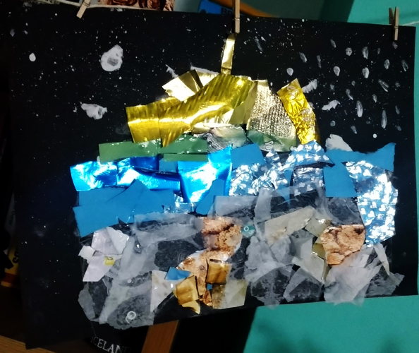


(F, M, Z)
No comments:
Post a Comment